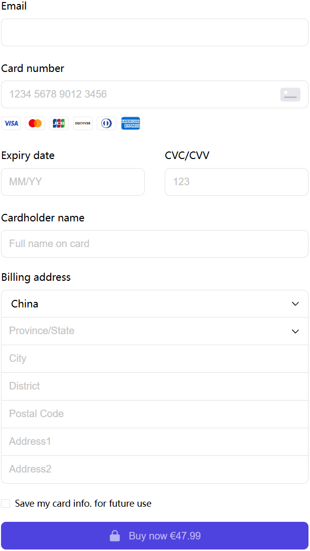
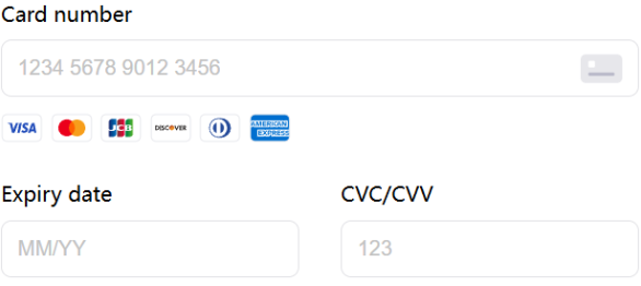
Split Card
Combine Card
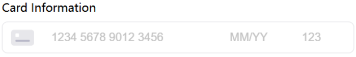
Card has two layouts:
- Split: Card Number, Expiry Date, and CVV are displayed separately.
- Combine: Card Number, Expiry Date, and CVV are displayed together.
// Import Card
import { Card } from '@paykka/card-checkout-ui'

// Initialize the component instance by passing parameters through the create method
const checkoutCard = paykkaCheckout.create(Card, {
  cardInfoLayout: 'split',
  onSubmit: formValidateError => {
    if (!formValidateError) {
      console.log('Form validation passed, proceed to payment')
    }
  },
  onSuccess: returnUrl => {
    console.log('Payment successful, redirect to:', returnUrl)
  },
  onError: error => {
    console.log('Payment failed, error info:', error)
  }
})

const container = document.createElement('div')
checkoutCard.mount(container)

const checkoutCardField = document.querySelector('#checkoutCardField')

// Insert container into the page
checkoutCardField && checkoutCardField.appendChild(container)Passed when calling the create method to create Card.
| Name | Description | Type | Default |
|---|---|---|---|
| cardInfoLayout | Defines the layout display of card sensitive information form. | split | combine | split |
| showCardBrands | Whether to display supported card brand icons. | boolean | true |
| styles | Custom styles.
| ElementStylesConfig | undefined |
| showEmail | Whether to display email.
| boolean | false |
| showAddress | Whether to display address.
| boolean | false |
| onSubmit | Form submission callback, triggered after clicking the payment button.
| (formValidateError?: Record<string, FormValidateError[]>) => void | undefined |
| onSuccess | Callback after successful payment.
| (data: PaymentSuccessData) => void | undefined |
| onError | Callback after payment failure, can resubmit the form for payment.
| (error: PayKKaError) => void | undefined |
| onTimeout | Callback when payment times out, can resubmit the form for payment. | () => void | undefined |
| onExpired | Callback when the checkout counter has expired during payment, cannot pay again. | () => void | undefined |
Methods and properties exposed by Card, can be called by the Card instance created via the create method, e.g.: checkoutCard.ref.payment().
| Name | Description | Type |
|---|---|---|
| payment | Make a payment, enabled when the payment button is not visible. See usage. | () => void |
Below is an explanation of some data types:
Information returned after successful payment.
interface PaymentSuccessData {
  /** URL that can be redirected to after successful payment */
  returnUrl?: string
}Custom form element styles. Currently, you can define the styles of input elements in the iframe. Styles of form elements outside the iframe can be overridden directly by writing CSS.
interface ElementStylesConfig {
  /** Styles for iframe input elements */
  input?: {
    /** Default style */
    base?: Partial<CSSStyleDeclaration>
    /** Style when validation passes */
    valid?: Partial<CSSStyleDeclaration>
    /** Style when validation fails */
    invalid?: Partial<CSSStyleDeclaration>
    /** Style when element is focused */
    focus?: Partial<CSSStyleDeclaration>
    /** Placeholder style */
    placeholder?: {
      /** Default style */
      base?: Partial<CSSStyleDeclaration>
      /** Style when element is focused */
      focus?: Partial<CSSStyleDeclaration>
    }
    /** Style when mouse hovers over the element */
    hover?: Partial<CSSStyleDeclaration>
  }
}
Example:
const cardProps = {
  // ...
  styles: {
    input: {
      base: {
        color: 'black'
      },
      valid: {
        color: 'green'
      },
      invalid: {
        color: 'red'
      },
      focus: {
        color: 'blue'
      },
      placeholder: {
        base: {
          color: 'gray'
        },
        focus: {
          color: 'black'
        }
      },
      hover: {
        color: 'pink'
      }
    }
  }
}